Transit Flows
Delighted by the screen line feature of GTFS Explorer, our Public Transport Team wondered if we could compute all screen lines at once for them and put them on a map for easy reference. Moreover, could we compute passenger counts across those screen lines too?
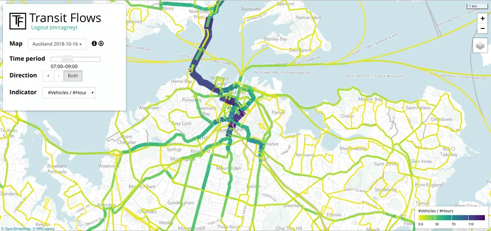
This sounded difficult, but after some reflection and experimentation we arrived at Transit Flows, a visualisation of public transport vehicle and passenger flows and an extension of our previous tool Corridor Explorer.
Transit Flows combines scheduling, reatltime, and ticketing data for a given date and colour- and thickness-codes all the segments of the network according to one of several key indicators, such as number of vehicles per hour. You can select an indicator, a direction of travel, and a time period, then quickly get a big-picture view of the network according to those parameters. Clicking on a segment reveals further detail about that segment, such as the indicator value broken down by route.

"Sweet as!" said the Public Transport Team and now use Transit Flows regularly on their network planning projects to answer pressing questions, such as where to install double-decker buses to avoid capacity bottlenecks.
 MRCagney Works